Select
Color
| Element | Property | Color token |
|---|---|---|
| Field | background | $field * |
| border-bottom | $border-strong * | |
| Inline select | background | transparent |
| Label | text color | $text-primary |
| Field text | text color | $text-primary |
| Helper text | text color | $text-helper |
| Icon | fill | $icon-primary |
* Denotes a contextual color token that will change values based on the layer it is placed on.

Examples of default and new selection select states
Interaction states
| Element | Property | Color token |
|---|---|---|
| Input:focus | border | $focus |
| Input:invalid | border | $support-error |
| Error message | text color | $support-error |
| Input:disabled | background | $field * |
| border-bottom | transparent | |
| Field text:disabled | text color | $text-disabled |

Examples of open, disabled, and help select states
Typography
Select text should be set in sentence case, with only the first word in a phrase and any proper nouns capitalized. Select text should be three words or less.
| Element | Font-size (px/rem) | Font-weight | Type token |
|---|---|---|---|
| Label | 12 / 0.75 | Regular / 400 | $label-01 |
| Field text | 14 / 0.875 | Regular / 400 | $body-compact-01 |
| Error message | 12 / 0.75 | Regular / 400 | $label-01 |
Structure
Select
| Element | Property | px / rem | Spacing token |
|---|---|---|---|
| Label | margin-bottom | 8 / 0.5 | $spacing-03 |
| Input | padding-left | 16 / 1 | $spacing-05 |
| Arrow | padding-left, padding-right | 16 / 1 | $spacing-05 |
| Field | border-bottom | 1px | – |

Structure and spacing measurements for select | px / rem
Inline select
| Element | Property | px / rem | Spacing token |
|---|---|---|---|
| Input | padding-left | 8 / 0.5 | $spacing-03 |
| Arrow | padding-left, padding-right | 8 / 0.5 | $spacing-03 |

Structure and spacing measurements for inline select (focused) | px / rem
Size
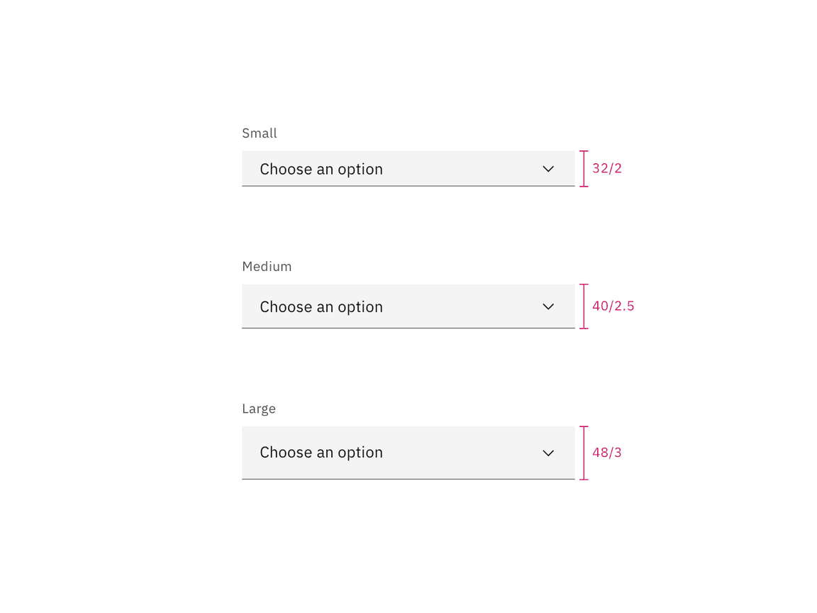
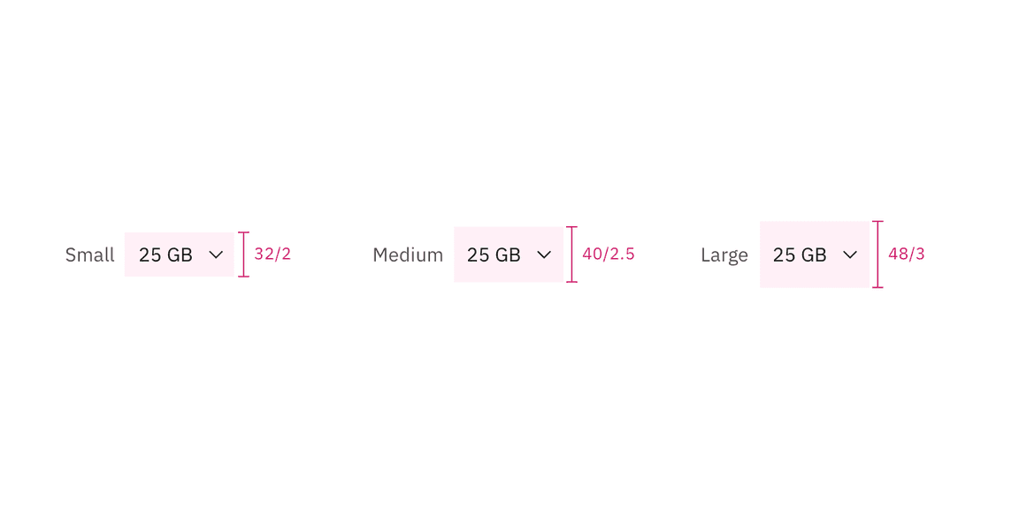
| Element | Size | Height (px / rem) |
|---|---|---|
| Input | Small (sm) | 32 / 2 |
| Medium (md) | 40 / 2.5 | |
| Large (lg) | 48 / 3 |

Sizes for default select | px / rem

Sizes for inline select | px / rem